Layout
Bringing structure to your pages
Layouts are common configurations based on existing Joystick components and utilities. With a consistent and cohesive set of layouts, Joystick strives to support some of our most important design principles:
- Clarity
- Efficiency
- Consistency
- Beauty
Layouts are comprised of several layout blocks and components that work together to give your page structure.
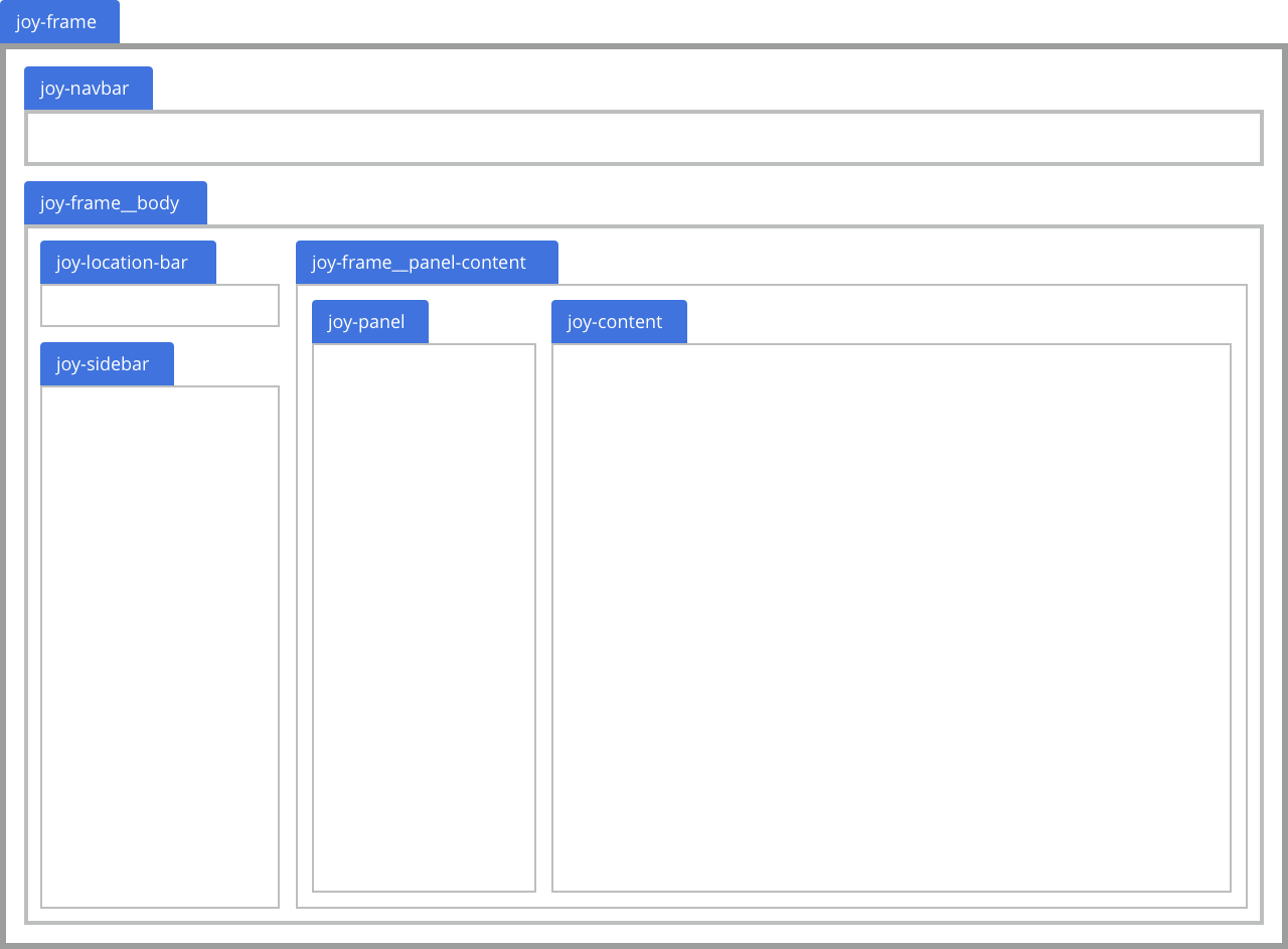
Frames
A Frame articulates the design’s underlying content framework based on your project goals, such as whether the goal is to display information, productive utility or both. Frame focuses on the page’s underlying content framework rather than the page’s final content. It also provides needed guardrails for the contents in websites or applications.
There are two basic types of frames: the Site Frame and the App Frame. App Frame allows you to build full-page apps that can include Sidebars, Panels, and more app-based components.
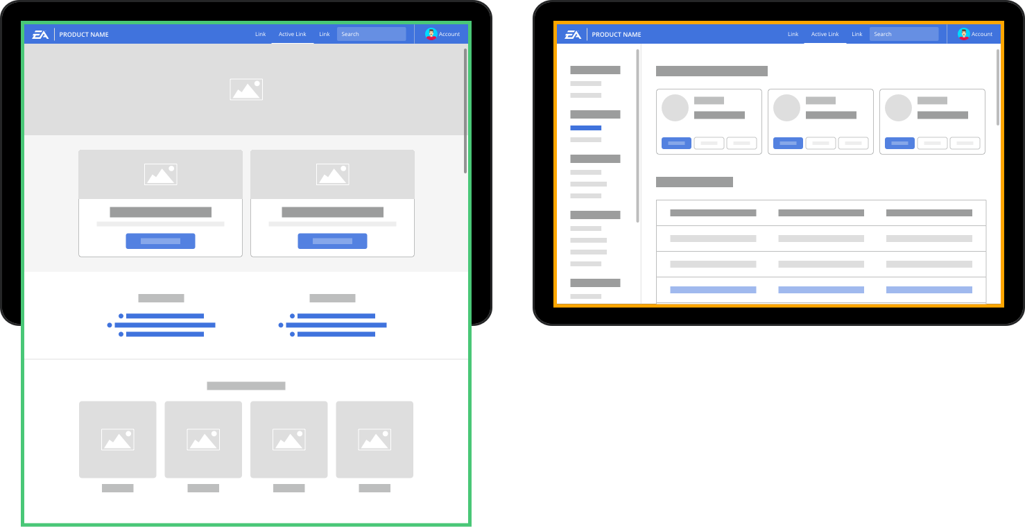
Site frame
Site Frames are used to to display information-based website or applications such as homepages, landing pages or product pages.
The site frame makes the page layout function like a basic website: the entire page will scroll up and down as content grows vertically - ideal for reading content.
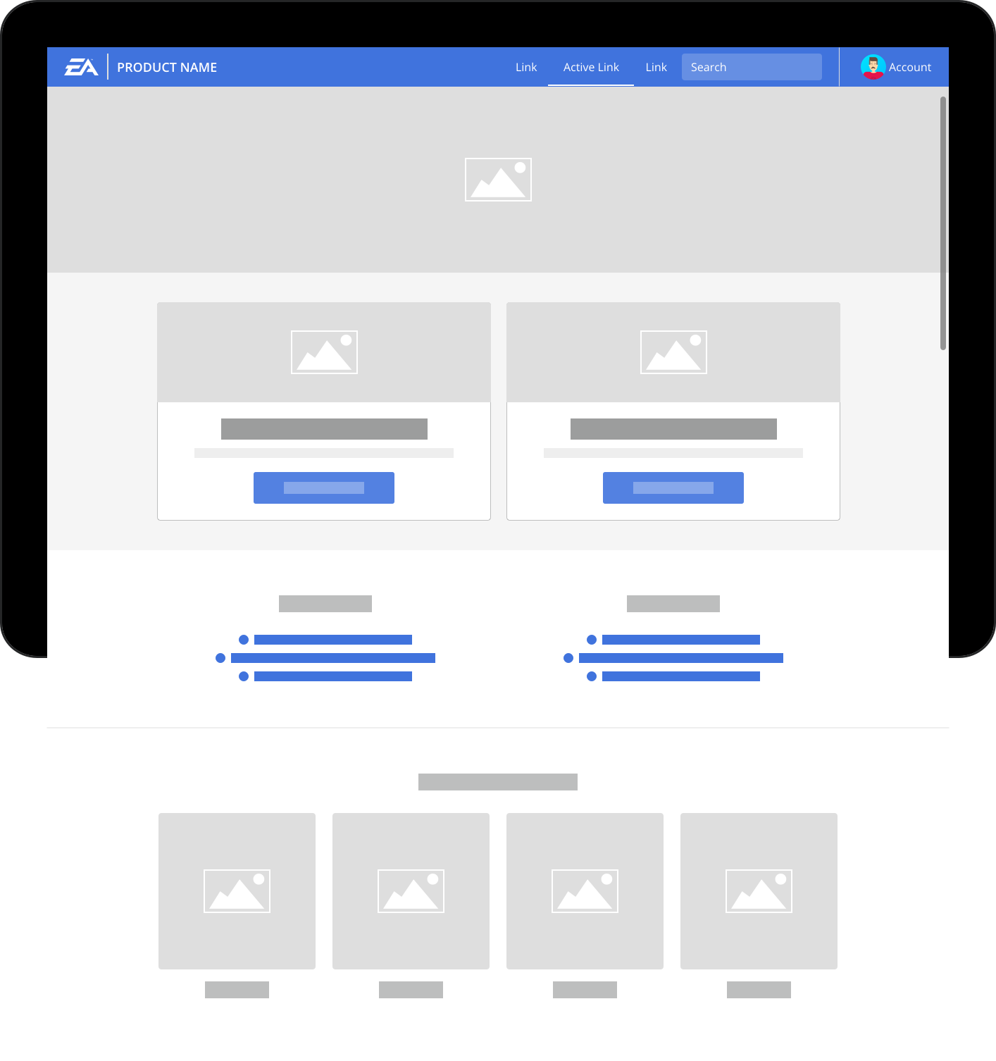
The .joy-frame--site class applies a few basic properties to the container:
display: flex;andflex-direction: column;to turn the element into a flex container that grows vertically.width: 100%;to make the container fill the width of the page.position: relative;to make children position behave properly when being transformed and moved around.
The classes .joy-frame--site and .joy-frame can be used interchangeably.
<div class="joy-frame--site">
  Your site goes here.
</div>
App frame
The App Frame makes your layout function more like an application or utility tool. Essentially, this means your app will have a fixed navbar and content blocks - such as sidebars or panels - that scroll independently of one another.
The App frame is ideal for utility pages, dashboards, or task-based applications.
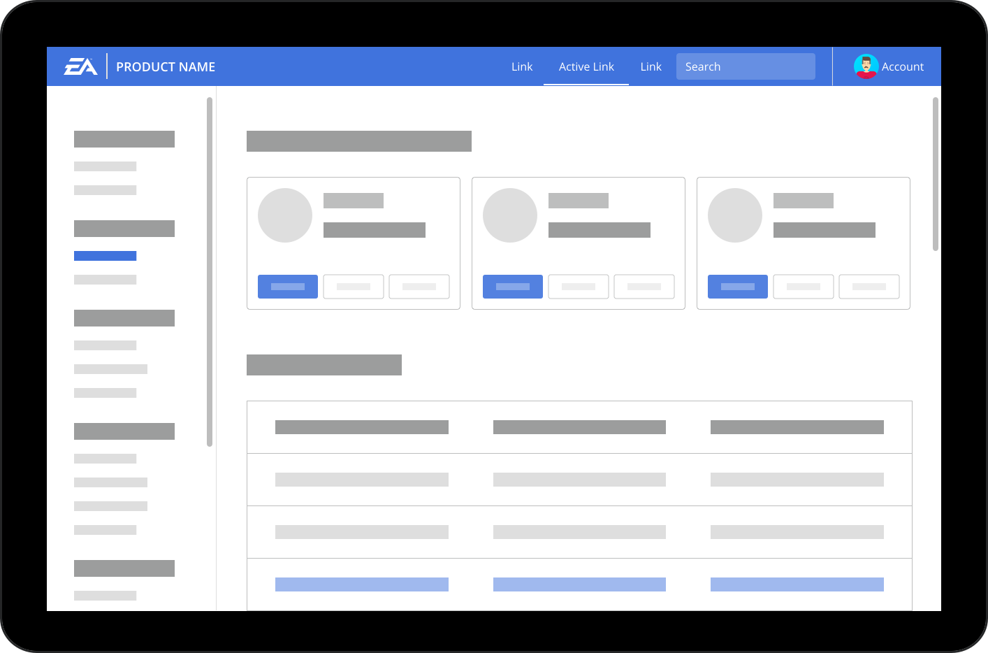
App frame inherits all of the properties of .joy-frame--site outlined above, and adds a few more:
- On small screens < 768px,
.joy-frame--appfunctions identically to.joy-frame--site - 768px and up, the
.joy-frame--app's height is set to100vh, or equal to the height of the viewport, and overflow is set to be hidden. - Since this is a
display: flex;element withflex-direction: column;, the navbar will be fixed at the top, and the content will grow to fill the rest of the space. The content will scroll independently of the rest of the page.
<div class="joy-frame--app">
  Your application goes here.
</div>
Frame Body
The .joy-frame__body is a child element of the .joy-frame. The purpose of this element is to make the main body content of the page grow vertically.
Element properties overview:
- Does NOT include the Navbar.
display: flex;- < 768px
flex-direction: column; - 768px and up:
flex-direction: row;andheight: calc(100% - $navbar-height); flex: 1 0 auto;
<div class="joy-frame--app">
  <div class="joy-navbar">
    ...Navbar...
  </div>
  <div class="joy-frame__body">
    ...Body content...
  </div>
</div>
Frame Panel-Content
The .joy-frame__panel-content is a child element of the .joy-frame__body. The purpose of this element is to make the main body content of the page grow vertically. This element is only required when creating a page that includes both a Sidebar and a Panel. This container element will ensure that all of the elements are positioned properly at every responsive breakpoint.
<div class="joy-frame--app">
  <div class="joy-navbar">
    ...Navbar...
  </div>
  <div class="joy-frame__body">
    <div class="joy-panel-toggle" data-toggle="panel">
      <i class="fa fa-chevron-right"></i>
    </div>
    <div class="joy-location-bar">
      ..Location Bar..
    </div>
    <div class="joy-sidebar">
      ..Sidebar..
    </div>
    <div class="joy-frame__panel-content">
      <div class="joy-panel">
      ..Panel..
      </div>
      <div class="joy-content">
      ..Content..
      </div>
    </div>
  </div>
</div>
Frame Classes
| Class | Applied to | Usage | Comments |
|---|---|---|---|
.joy-frame--site |
<div> |
Required | Creates a site layout where the entire page grows and scrolls vertically |
.joy-frame--app |
<div> |
Required | Creates an app layout where the page height is 100% of the viewport height and content elements such as a sidebar and content scroll independently |
.joy-frame |
<div> |
Optional | Identical to .joy-frame--site |
.joy-frame__body |
<div> |
Required | Direct child of either .joy-frame--site or .joy-frame--app |
.joy-frame__panel-content |
<div> |
Optional | Direct child of .joy-frame__body. Only used if the page uses both .joy-sidebar and .joy-panel. |
Sidebar
The sidebar is a form of sub-navigation that provides your users with a way of navigating within your application without interfering with the global navbar.
The sidebar is also responsive so that the app can be accessed on smaller devices. On smaller screens, the mobile-only element .joy-location-bar becomes visible below the .joy-navbar and is used to toggle hiding and showing the sidebar.
On smaller screens, the .joy-sidebar can be hidden/shown by toggling the class .joy-sidebar--is-visible on the .joy-frame--app element.
<div class="joy-location-bar" data-toggle="sidebar">
  <div class="joy-location-bar__title">
    Sidebar Link 2
  </div>
  <div class="joy-location-bar__toggle">
    <i class="fa fa-chevron-down"></i>
  </div>
</div>

<div class="joy-sidebar">
  <h2 class="joy-sidebar__heading">
    Sidebar Heading
  </h2>
  <ul class="joy-sidebar__links">
    <li class="joy-sidebar__link-item"><a class="joy-sidebar__link" href="javascript:void(0);">Sidebar Link 1</a></li>
    <li class="joy-sidebar__link-item joy-active"><a class="joy-sidebar__link " href="javascript:void(0);">Sidebar Link 2</a></li>
    <li class="joy-sidebar__link-item"><a class="joy-sidebar__link" href="javascript:void(0);">Sidebar Link 3</a></li>
    <li class="joy-sidebar__link-item"><a class="joy-sidebar__link" href="javascript:void(0);">Sidebar Link 4</a></li>
  </ul>
</div>
Sidebar Classes
| Class | Applied to | Usage | Comments |
|---|---|---|---|
.joy-location-bar |
<div> |
Required | This is class needs to be toggled when showing/hiding modals. Only visible below 768px |
.joy-location-bar__title |
<div> |
Required | Should contain information about the current location or state of the app |
.joy-location-bar__toggle |
<div> |
Required | Indicator to hide or show sidebar |
.joy-sidebar |
<div> |
Required | Containing element for the sidebar |
.joy-sidebar__heading |
<h1-6> |
Optional | Title of a section of the sidebar links |
.joy-sidebar__links |
<ul> |
Required | List of Links |
.joy-sidebar__link-item |
<li> |
Required | List item for sidebar Links |
.joy-sidebar__link |
<a> |
Required | Clickable Link |
.joy-active |
<li class="joy-sidebar__link-item>" |
No more than 1 per page | Highlights the active link |
.joy-sidebar--is-visible |
<div class="joy-frame--app"> |
Toggle | Use to toggle hiding and showing the sidebar below 768px |
Panel
A Panel is a layout component that is used to either display additional information or display task-based actions. Panels are useful when you have a list of items, and each item has details to view or edit, which allow users to quickly navigate and see details from item to item.
On viewports smaller than 1008px, a Panel can be hidden or shown using the .joy-panel-toggle which should toggle the class .joy-panel--is-visible on .joy-frame--app element.
Panel
Lorem ipsum dolor sit amet, consectetur adipisicing elit. Reprehenderit in labore consequuntur sint ratione, repellat, iste enim, magni ad veniam numquam odio facilis necessitatibus laudantium voluptas, laboriosam molestias quod quam!
<div class="joy-panel joy-text-longform joy-p-around--large">
  <h1 class="joy-text-heading--medium">Panel</h1>
  <p>Lorem ipsum dolor sit amet, consectetur adipisicing elit. Reprehenderit in labore consequuntur sint ratione, repellat, iste enim, magni ad veniam numquam odio facilis necessitatibus laudantium voluptas, laboriosam molestias quod quam!</p>
  <div class="joy-button-group joy-m-top--large" role="group">
    <button class="joy-button">Back</button>
    <button class="joy-button">Next</button>
  </div>
</div>
<div class="joy-panel-toggle" data-toggle="panel-demo">
  <i class="fa fa-chevron-right"></i>
</div>
Panel Classes
| Class | Applied to | Usage | Comments |
|---|---|---|---|
.joy-panel |
<div> |
Required | Containing element for Panel |
.joy-panel--is-visible |
<div class="joy-frame--app"> |
Toggle | Use to toggle hiding and showing the panel below 1008px |
.joy-panel-toggle |
<div> |
Required | Toggle button used to toggle the .joy-panel--is-visible class. Direct child of <div class="joy-frame__body"> |
.joy-layout--panel |
<div class="joy-frame--app"> |
Optional | Use only when you have an app layout that does not include a sidebar. |
Content
Content is where the user focuses the majority of their attention. From gathering information to performing tasks, it is the primary canvas for your application. As the largest portion of your app, the content is always visible by default.
The content element should be a direct child of .joy-frame__body, same as joy-sidebar or .joy-panel.
<div class="joy-content">
  Your primary content goes here.
</div>
Panel Classes
| Class | Applied to | Usage | Comments |
|---|---|---|---|
.joy-content |
<div> |
Required | Direct child of .joy-frame__body, unless using Sidebar + Panel layout, in which case it is the direct child of .joy-frame__panel-content |